Bluetooth Payload Throughput Over Time Graph
The following figure depicts the Payload
Throughput Over Time graph.
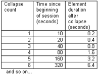
.jpg) The Payload Throughput Over Time graph shows total payload
for each successive time interval. The time interval is initially 0.1
second. Each time the number of throughput elements reaches 100, they
are collapsed into a set of 50 by combining adjacent elements and doubling
the duration of each element. Collapsing thus occurs as follows:
The Payload Throughput Over Time graph shows total payload
for each successive time interval. The time interval is initially 0.1
second. Each time the number of throughput elements reaches 100, they
are collapsed into a set of 50 by combining adjacent elements and doubling
the duration of each element. Collapsing thus occurs as follows:

- The bottom of the graph shows a beginning time and an ending time. The beginning time is relative to the start of the session and initially 0. When packets start wrapping out it becomes the relative time offset of the first available packet. The ending time is always the total time of the session.
- Discontinuities are indicated by vertical dashed lines.
- A green view port indicates the time range corresponding to the visible slots in the timeline. The view port can be moved by clicking elsewhere in the graph or by dragging. Whenever it is moved, the timeline scrolls to match. When the slot range in the timeline changes, the view port moves and resizes as necessary to match.
- The Swap button - switches the position of the Timeline and the Throughput graph.
- Show Running Average - Selecting this check box shows a running average in the Throughput
Over Time graph as an orange line.
- Show slave LT_ADDR - Selecting this checkbox displays the Slave LT_ADDR in the timeline row labels.
Comparison with the Coexistence View Throughput Graph
The throughput graphs for Classic Bluetooth in the Coexistence View and the Bluetooth Timeline can look quite different even though they are plotting the same data. The reason is that the Coexistence View uses timestamps while the Bluetooth Timeline uses Bluetooth clocks, and they do not always match up exactly. This mismatch can result in the data for a particular packet being included in different intervals in the two throughput graphs, and can have a significant impact on the shapes of the two respective graphs. This can also result in the total duration of the two throughput graphs being different.
Another factor that can affect total duration is that the Bluetooth Timeline’s throughput graph stops at the last Classic Bluetooth packet while the Coexistence View’s Throughput Graph stops at the last packet regardless of technology.